

Neutral interiors have an enduring appeal. Shades of cream, beige, taupe, and gray create a peaceful atmosphere and allow furniture to remain visually balanced. However, a room built entirely around similar colors can sometimes feel flat or unfinished.
The solution does not always involve introducing bright paint or colorful furniture. Texture, pattern, and carefully selected floor coverings can add depth while preserving a restrained color palette. Understanding how these elements interact helps homeowners create spaces that feel comfortable without becoming visually crowded.
Why Neutral Rooms Need Texture
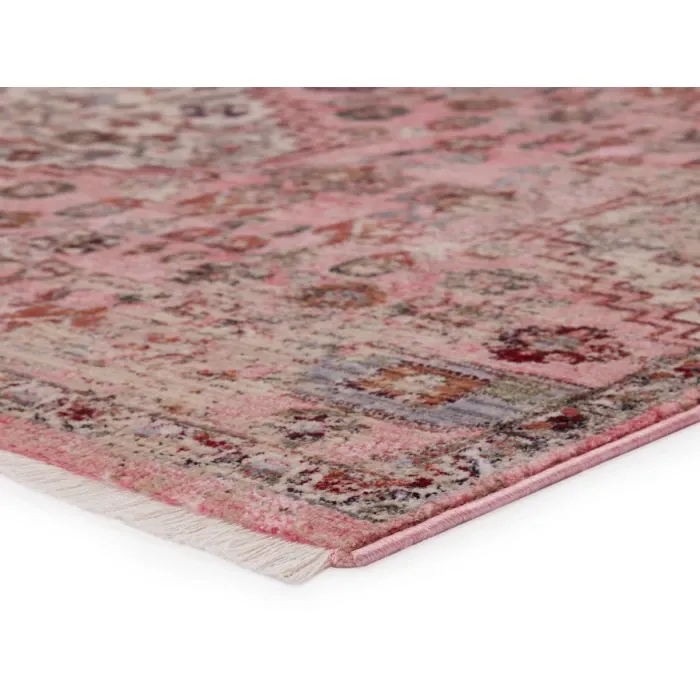
Color is only one part of interior design. Surface texture influences how light moves through a room and how different materials appear alongside one another. A living room with smooth walls, polished flooring, and plain upholstery may lack visual variation. Introducing a rug with a distinctive weave or raised pattern can create contrast without changing the existing colors.
For example, collections of Jaipur living rugs offer a useful starting point for exploring different rug aesthetics, including designs that emphasize texture and decorative detail. The most effective choice depends on the furniture already present. A heavily textured rug may complement simple seating, while an understated surface can balance furniture with more elaborate detailing.
Build Depth Through Different Materials
Layering materials is an effective way to make neutral interiors more interesting. Wood, linen, leather, glass, and woven textiles each contribute a different surface quality. A rug can connect these materials by introducing a softer visual foundation. Its texture may contrast with hardwood flooring while complementing upholstered furniture.
Consider a room with a wooden coffee table, linen sofa, and metal-framed chairs. A textured area rug can soften the combination and make the seating arrangement feel more inviting. The objective is not to include as many materials as possible. Instead, select a few complementary textures and repeat them thoughtfully throughout the room.
Pattern Can Replace Strong Color
Patterns introduce movement and personality even when a room relies on restrained colors. Subtle stripes, distressed motifs, geometric shapes, and traditional-inspired patterns create different decorative effects.
Large-scale patterns generally feel more prominent, especially in smaller rooms. Fine patterns may appear quieter from a distance, although their effect also depends on color contrast.
Homeowners can use several simple principles when introducing pattern:
-
Combine detailed rugs with relatively plain upholstery.
-
Repeat one rug color in another decorative accessory.
-
Use gentle tonal differences for a restrained appearance.
-
Consider pattern scale in relation to furniture size.
-
Avoid mixing several competing motifs without a common visual element.
These guidelines provide flexibility rather than rigid decorating rules. A room can successfully combine multiple patterns when their colors and proportions work together.
Creating Contrast Without Losing Harmony
A neutral room benefits from contrast, but excessive differences can interrupt its calm appearance. The key is introducing visual interest in controlled amounts. Collections of Kas rugs allow shoppers to explore decorative approaches that may suit both colorful and understated interiors.
For a room dominated by light beige furniture, a rug containing muted blue or charcoal accents can establish a focal point. Those darker shades can be repeated through artwork or cushions to maintain continuity. Alternatively, a room with dark wooden flooring may benefit from a lighter rug that separates the seating furniture from the floor.
Contrast should support the room’s overall composition rather than draw attention away from every other element.
Pay Attention to Natural and Artificial Light
Lighting changes the way rug colors and textures appear. A warm ivory rug may look different beside a north-facing window than it does under warm indoor lighting. Rooms receiving strong daylight can reveal subtle variations in textured fibers. During the evening, artificial lighting may soften these details or emphasize shadows.
Before choosing a rug, observe the room at different times of day. Consider whether the flooring and furniture appear warmer or cooler under changing conditions. When possible, examine material samples in the actual room. Digital images offer useful guidance, but screens cannot perfectly reproduce every color or texture.
Preserve Enough Visual Space
Decorating with texture does not mean filling every available surface. A room also needs areas of visual rest. If the rug has a prominent pattern, keep surrounding accessories relatively simple. Plain curtains, uncluttered tabletops, and carefully chosen cushions allow the rug to remain a meaningful design element.
Rug placement matters as well. Leaving a consistent border of visible flooring can help define the seating area while maintaining a balanced relationship with the room.
Conclusion
Neutral interiors become more engaging when texture, pattern, lighting, and material combinations receive thoughtful attention. A well-chosen rug can introduce visual interest without overwhelming the room or requiring major decorative changes. Rather than focusing only on color, homeowners should consider how different surfaces interact throughout the day. RugsTown.com provides access to varied rug collections that can support both subtle and expressive decorating preferences, helping homeowners find floor coverings that complement their existing interiors.